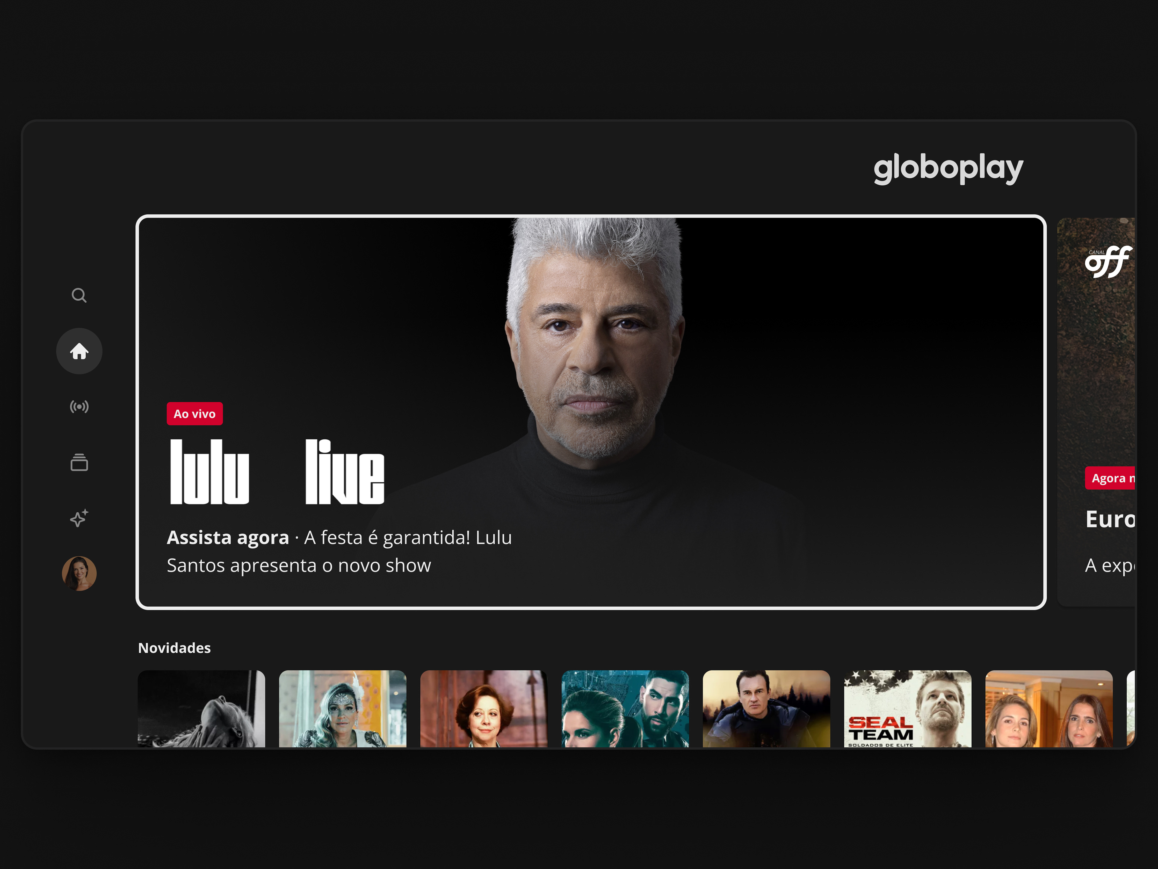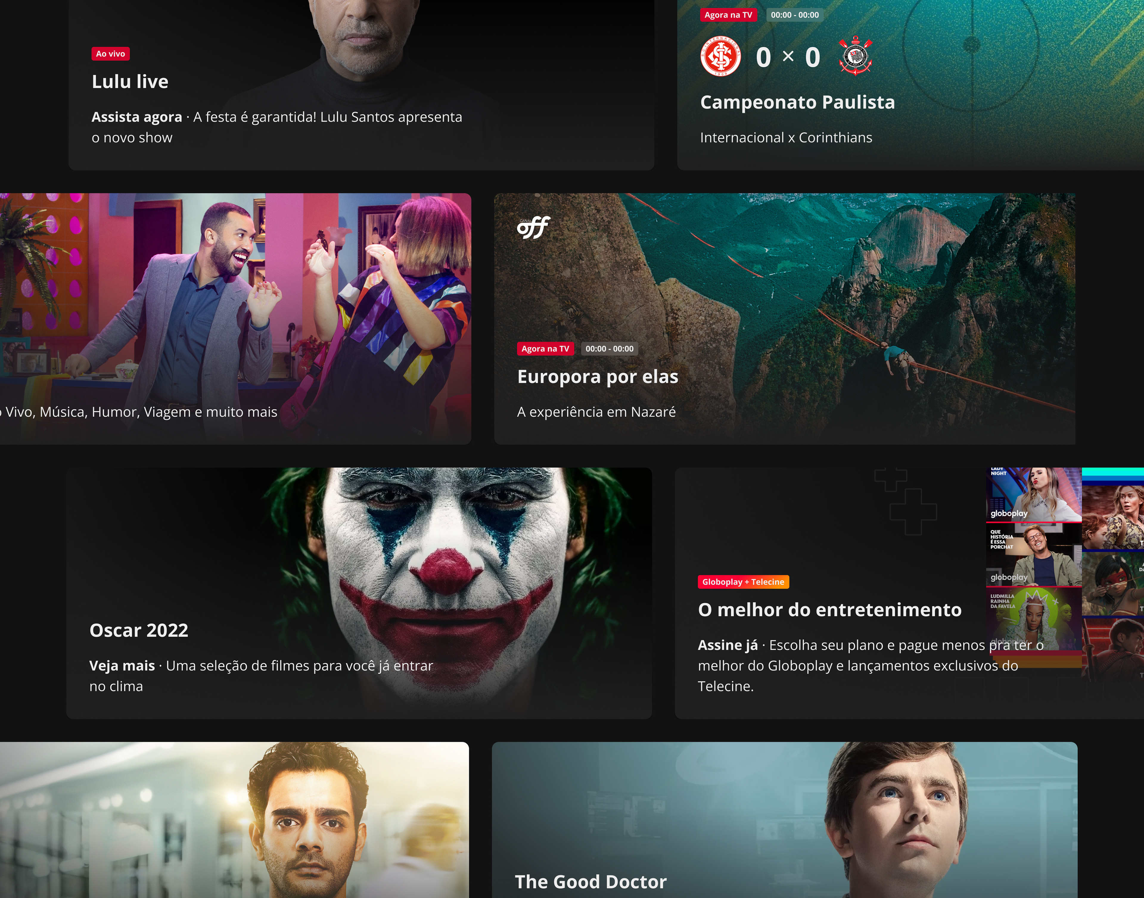
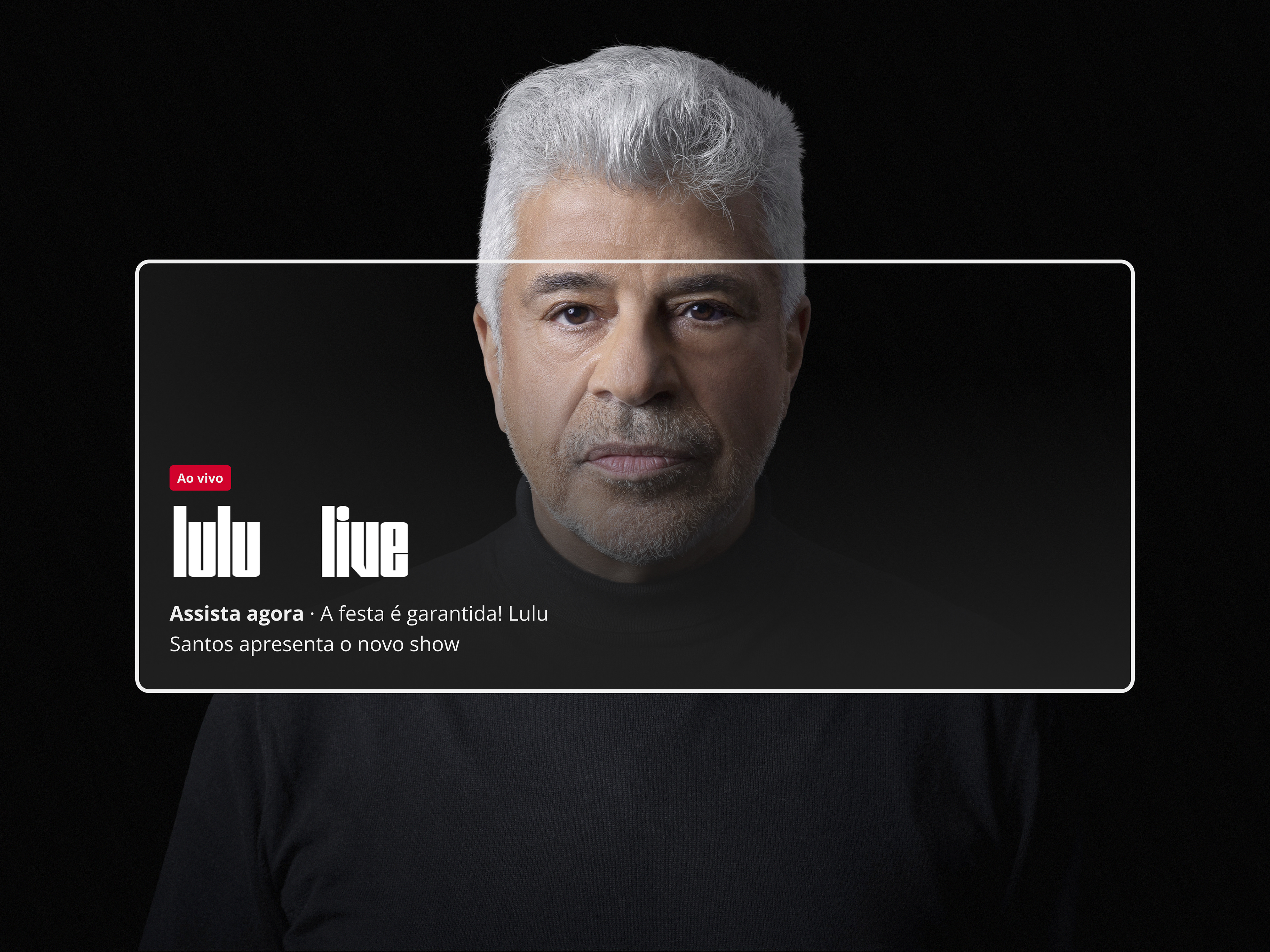
The Premium Highlight component was initially conceived to bring greater visibility to key content across Globoplay. The visual concept was developed by designer Gabriela Lopes, and the challenge was transforming this idea into a scalable and production-ready component that could work consistently across web, mobile, and TV.
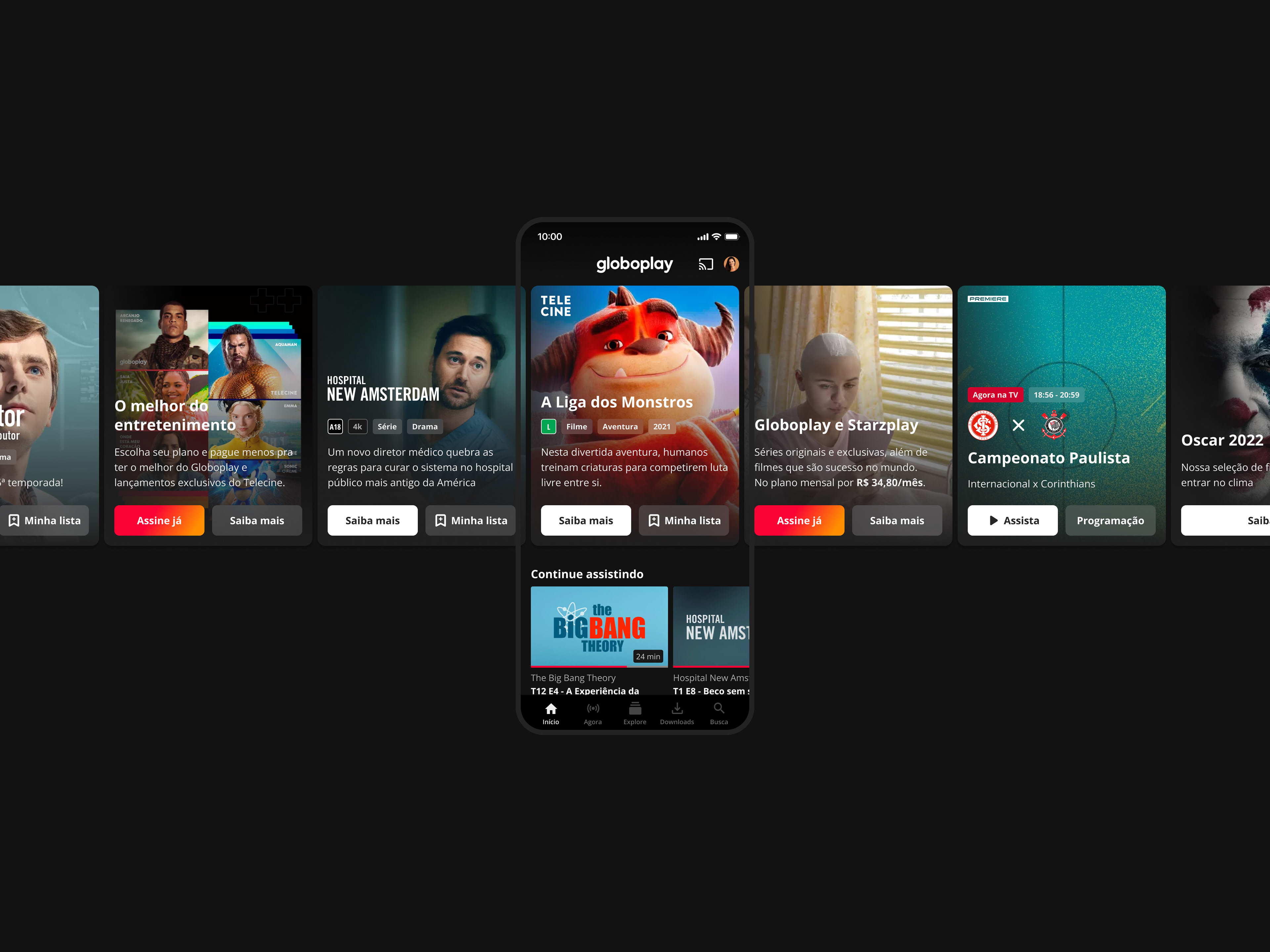
The project required aligning multiple teams and adapting the component to different contexts, including sales promotions, channels, live streams, and editorial highlights. As the work evolved, we identified the need to tailor implementations for each platform to ensure the best performance and user experience.
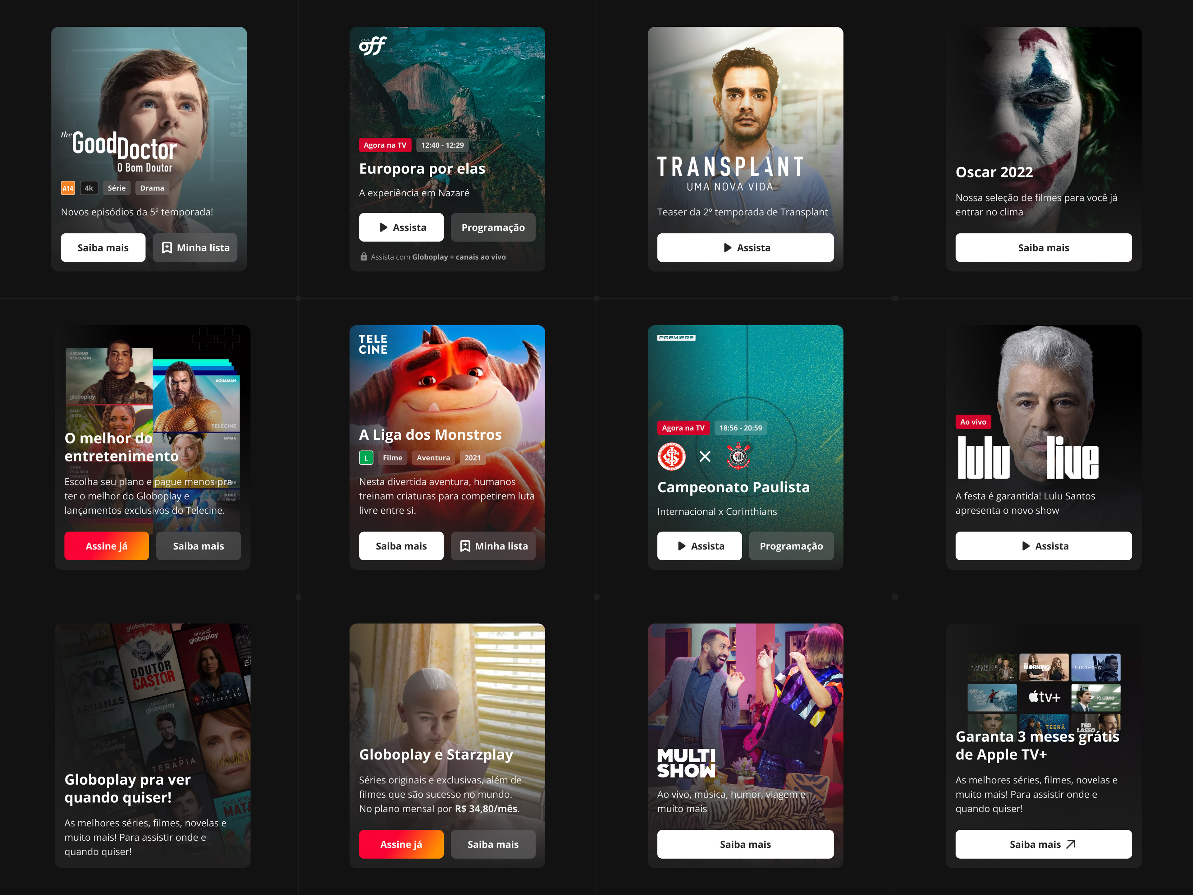
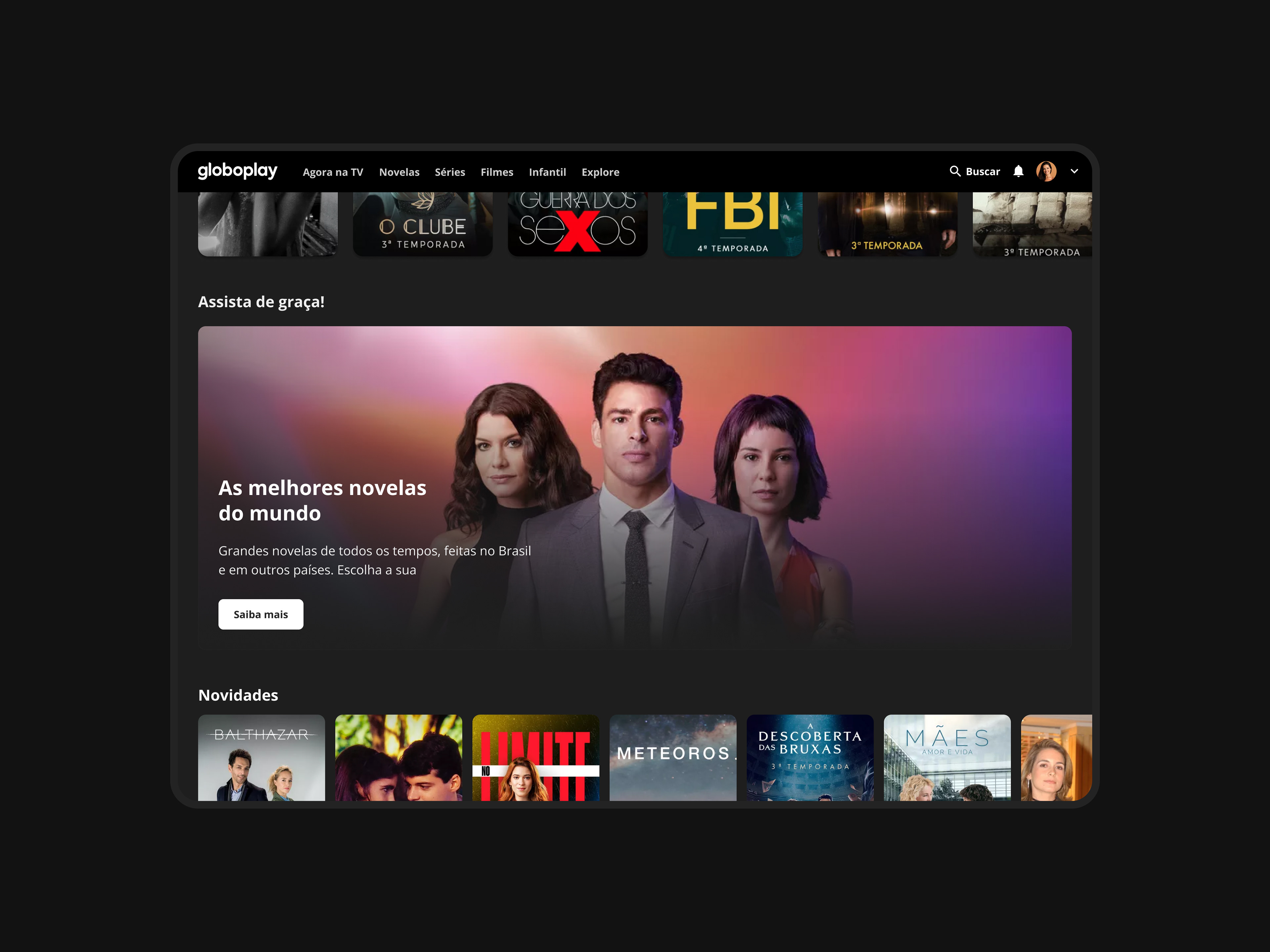
In parallel, I redesigned the in-between rails highlight, adapting the component for high-density content environments while maintaining visual consistency with the main experience. We also partnered with Growth and UX Research to run an A/B test evaluating versions with and without a call-to-action button.
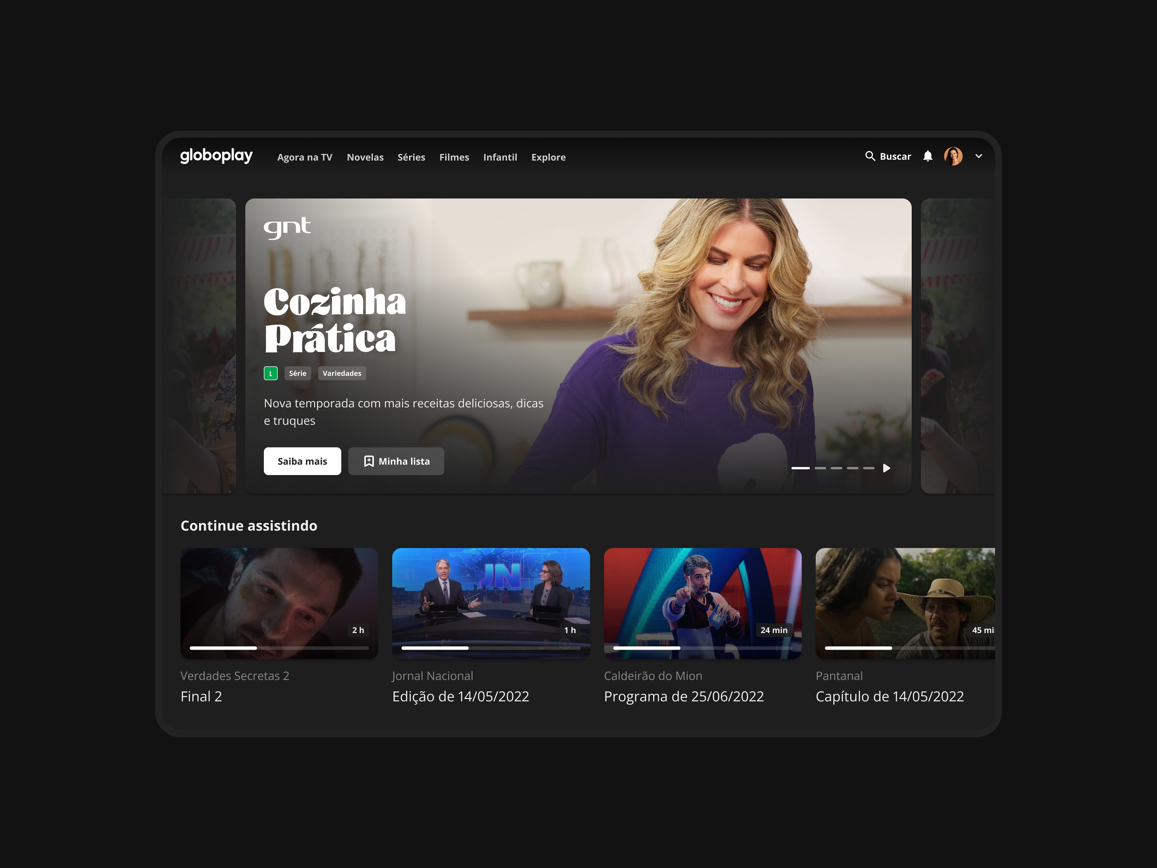
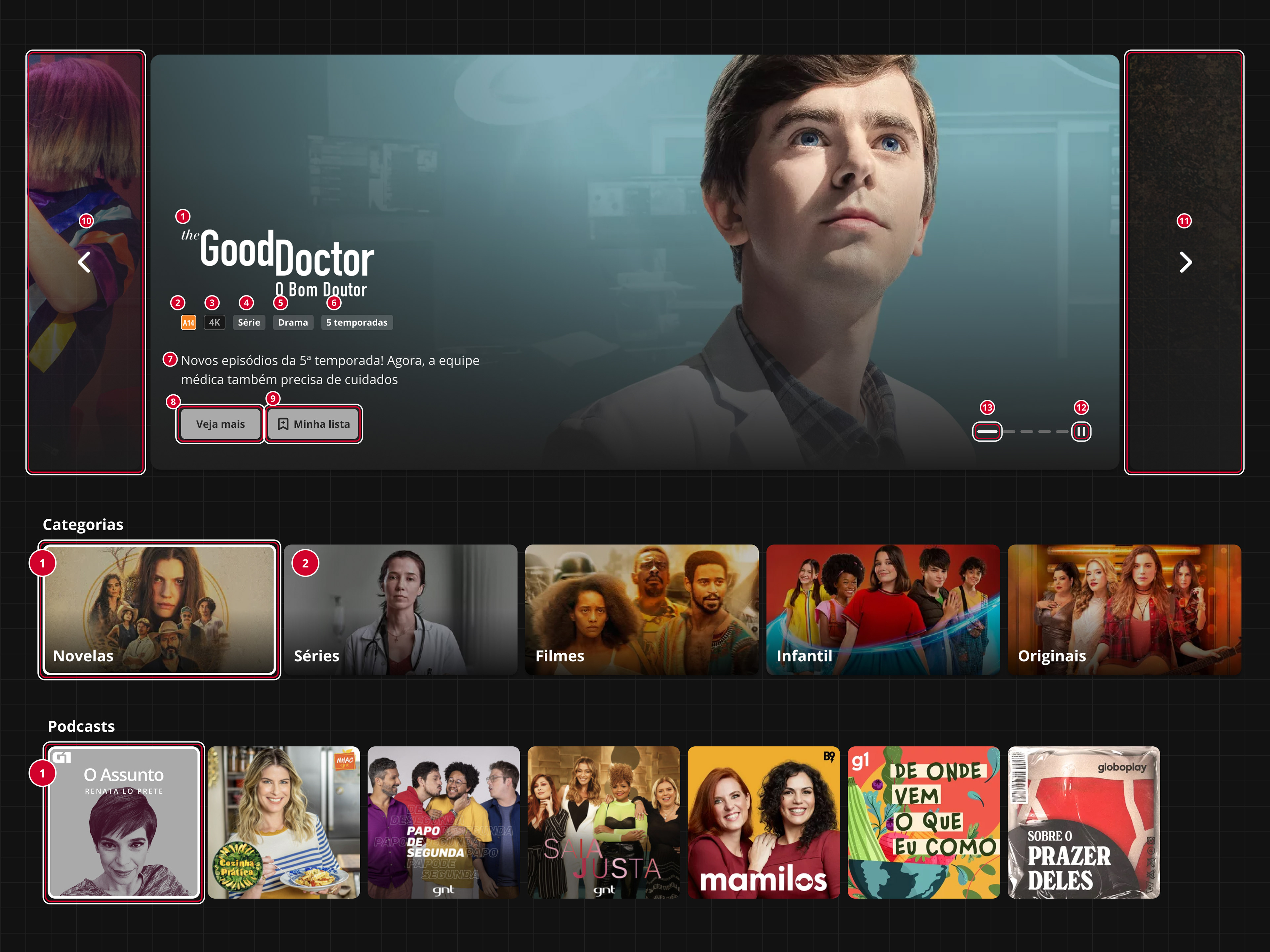
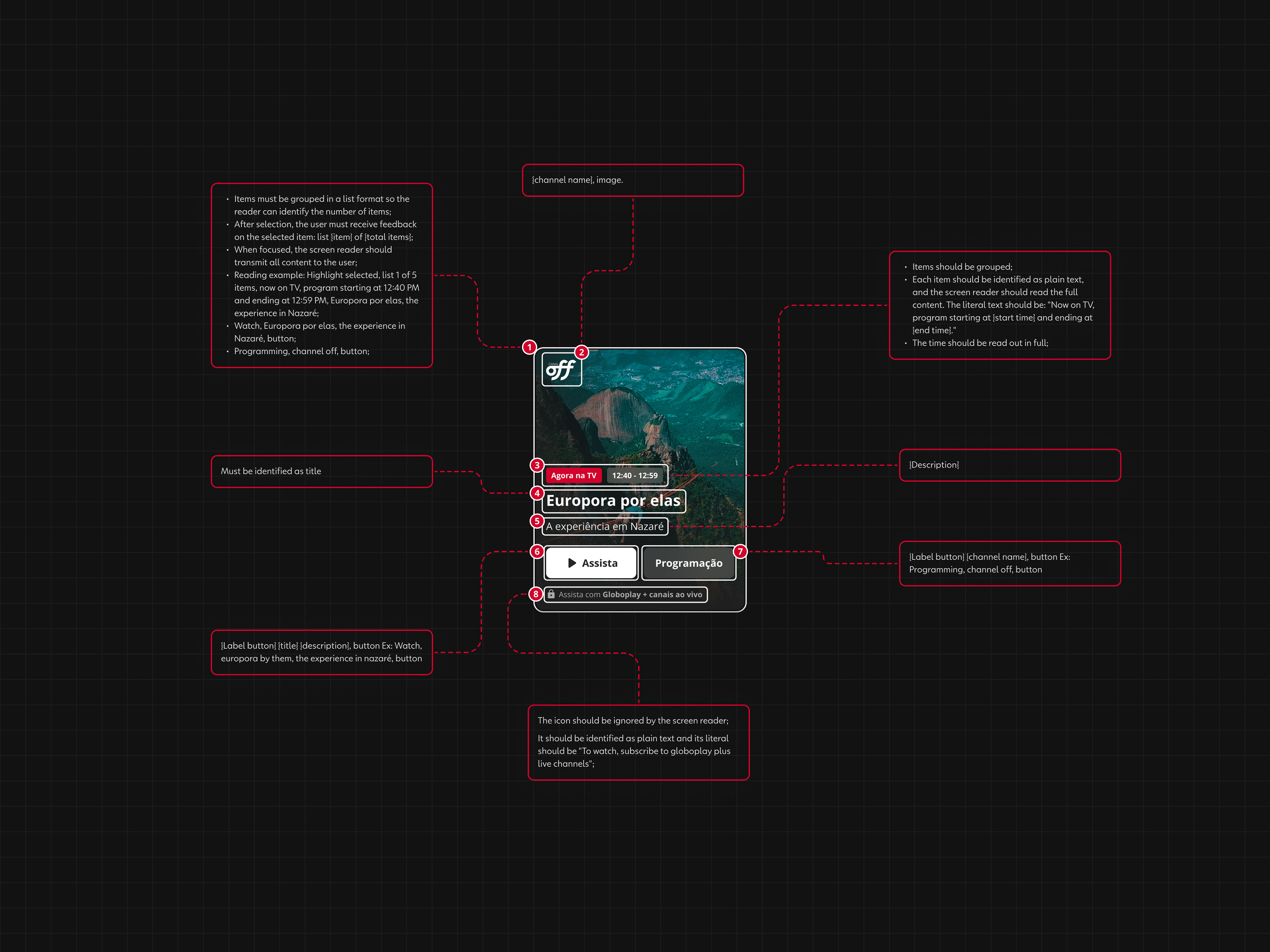
I collaborated on refining the component and led the work to bring it to production, aligning with engineering teams, documenting specifications and accessibility requirements, and validating the experience through testing. The result improved clarity, accessibility, and engagement across one of the platform’s most visible UI elements.