Challenge
Designing an institutional website for Brazil's largest broadcaster, which reaches across the entire national territory and touches a hundred million viewers, is a significant undertaking. With its diverse range of brands, it became essential to reinforce the "Uma só Globo" concept.
Solution
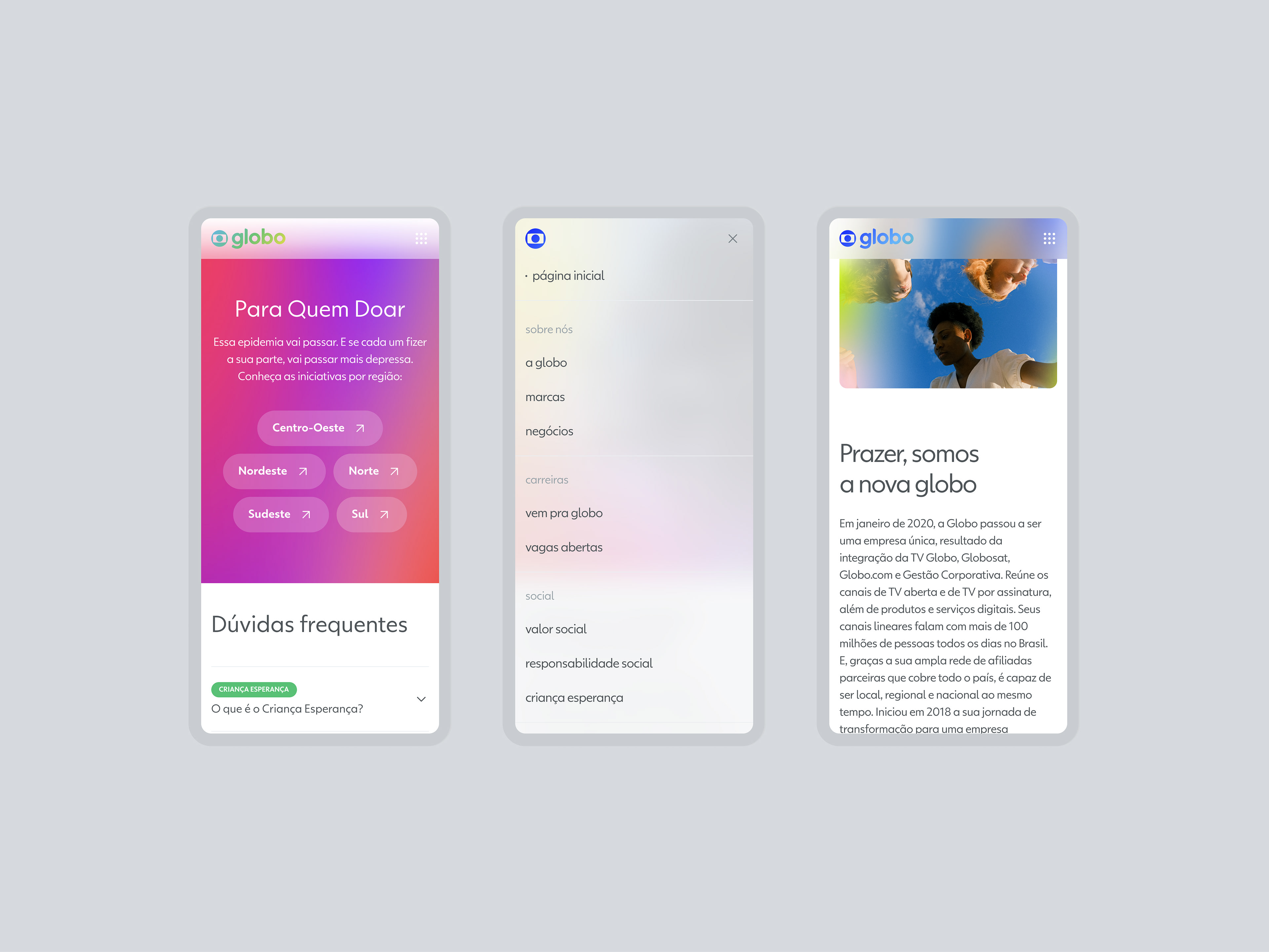
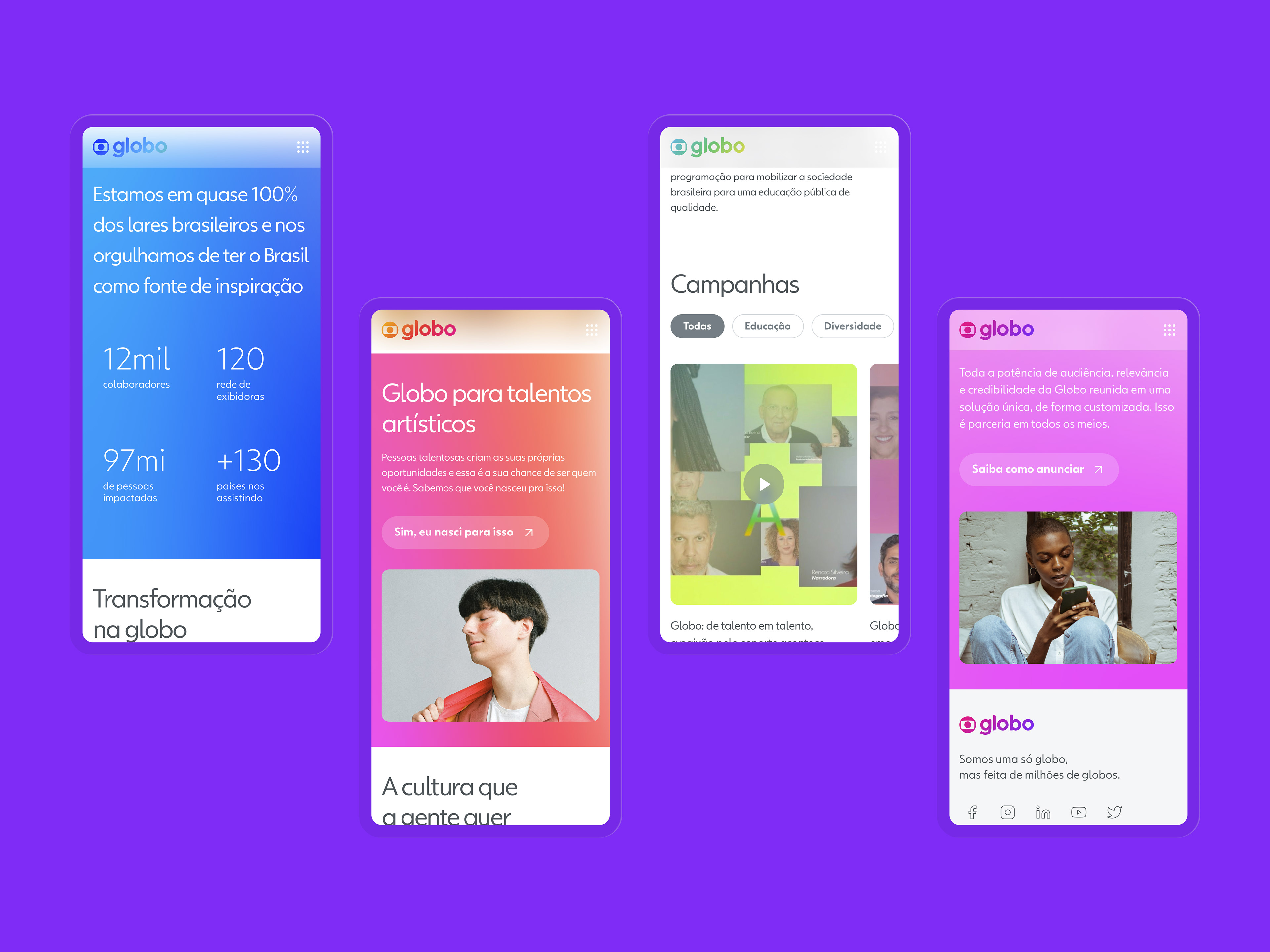
A user-centric design was conceived, prioritizing and highlighting the brand's identity. This was achieved by incorporating vibrant colors and gradients, conceptual imagery, and a modular framework designed to efficiently serve various content areas.
Design details
We employed the Globotipo typography – a typeface crafted specifically for Globo. Additionally, the glass effect was incorporated to enhance the brand's vibrant colors without compromising the user's visual experience.